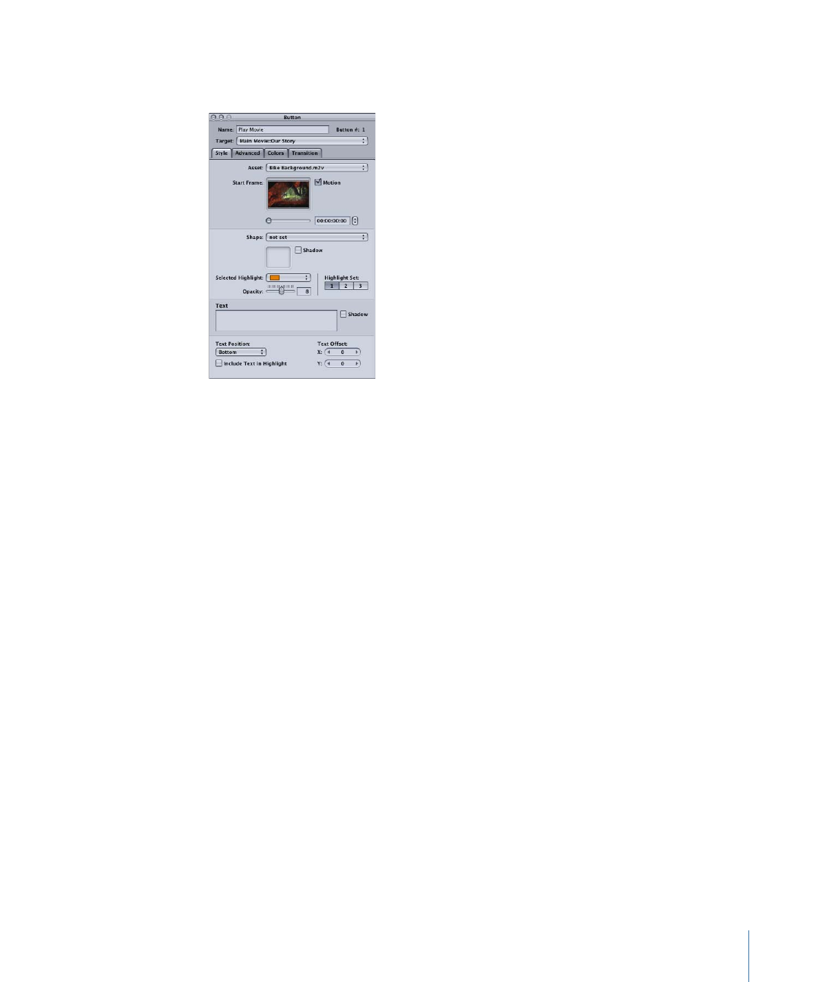
Style Tab in the Button Inspector
The Style tab of the Button Inspector contains the most commonly used settings.
• Asset: Use this pop-up menu to assign an asset to the thumbnail of the shape (if present)
or, when there is no shape, to the button’s active area. You can choose any existing
applicable assets.
• Start Frame: When the asset assigned to this button is a video clip, this area displays
the video. Use the slider or timecode entry to choose the start point for motion playback
(if motion is enabled) or to choose the frame to use in the button’s thumbnail if motion
is not enabled.
• Motion: Select this checkbox to enable motion in the button when the button’s asset
is a video clip. See
Configuring Motion Menu Settings
for looping details with motion
buttons.
• Shape: Use this pop-up menu to choose a shape to assign to the selected button. A
thumbnail image of the selected shape appears next to the pop-up menu. The pop-up
menu lists the existing shapes by their names, grouped as Apple Shapes (supplied with
DVD Studio Pro), Custom Shapes (added shapes available to all projects), Project Shapes
(added shapes available to this project only), and Patch Shapes. Use the Palette’s Shapes
tab to manage the shapes and as another way to select a shape.
• Shadow: Select this checkbox to apply the menu’s drop shadow setting to this shape.
• Selected Highlight: Choose the button’s selected state highlight color from the 16-color
palette.
Note: This does not affect the button’s normal or activated states. Use the settings in
the Colors tab for those highlights.
• Highlight Set: Select the color mapping set (1, 2, or 3) to use for this button.
273
Chapter 13
Creating Menus Using the Standard Method

• Opacity: Use this slider or enter a numeric value to set the selected highlight’s
transparency from 0 (completely transparent) to 15 (completely opaque).
Note: The Selected Highlight and Opacity settings affect the black color mapping
settings for the selected color mapping highlight set. These settings affect all buttons
on this menu, including overlay buttons, that use the same color mapping set.
• Text: You can type text directly on the button in the Menu Editor or type it in this text
area, then press Return to apply it to the button. To start a new line, press Option-Return.
See
Adding Text to a Button
for more information.
• Shadow: Select this checkbox to apply the menu’s drop shadow setting to this button
text.
• Text Position: Choose where you want to place the text when adding text to a button.
Choices include Bottom, Top, Right, Left, and Center. Use the Center setting when
creating a text-only button.
• Text Offset X and Y: Adjust the position of the text using these settings. For the horizontal
(X) offset, positive numbers move the text to the right and negative numbers move it
to the left. For the vertical (Y) offset, positive numbers move the text down and negative
numbers move the text up.
• Include Text in Highlight: Select this checkbox to make the button text highlight when
the button is selected or activated.
274
Chapter 13
Creating Menus Using the Standard Method